Thursday, 26 April 2012

Evaluation Q4 :How did you use media technologies in the construction and research, planning and evaluation stages?

Using media technologies I first of all used Photo editing software, called Adobe Photoshop to edit and create my photos for my digipak. I first of all up loaded a photo of my artist smoking outside, that I had taken from a photo shoot with our model who is pretending to be the artist for our video. I then enlarged the photo and converted the photo to black and white, adding a grain texture to the photo to make it look more vintage and follow the conventions of the the artist the Weeknd. I then cropped the photo, removing half of the models face to add to one of the Weeknds conventions of being Mysterious .


Here is the finished Manipulation and the first type of technology that i used in order to construct my media Text.


To research and plan our Music video we took part in a Brainstorm in which our progress and thought's were recorded on a piece of paper, whilst being recorded by a video camera. to create our music video we had to make sure we went in correctly tooled and no no a wasting time process. We created three storyboards, containing the sequence in which our music video would be filmed. we included shot tittle's and what was going to occur during the filming of that scene. we also took photos of settings and the places that we would be filming in. this was so that is was so the Mise-En-Scene me and my group were trying to create was clearly visible. We also took part in some radial analysis's to research what was already out there.

Here is the brainstorm done in school.


To complete the evaluation of our created media texts we used Web 2.0. we used a mix up of Social networking websites such as Youtube, Facebook & Twitter. These social networking websites were used to share our texts and receive Constructive criticism from people who view our video. We used the website Blogger to show evidence of our work and progress. This was a self created blog with our own input's of what we thought and found out. This was so that we could shows our progress as we designed or processed different media texts.


When using media technologies we varied in the type of media we used we went from Web 2.0 to radial analysis's of different media texts related to our genre. These media technologies were very useful because they applied to our target audience. They helped us reach ur target audience as when it comes to Graham Burton's Uses & Gratifications theory theses are the main means and modes of Social Interaction.


Evalution Q3 :What have you learned from your audience feedback?


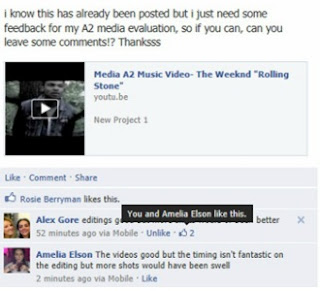
To obtain my audience feedback and learn something from what me and my group have created we decided to post our Music Video Upon the Web 2.0, Social Networking website Facebook.


Once the video was posted it wasn't to long before the first comment of criticism came in. 'Editing is good but more shots would have been better' from this me and my group can tell that our skills in how we post produced this text was of good quality but people wanted to see more in terms of scenes. this is something we can take in to account when creating another video in the near future.  


It wasn't to long before the second comment of criticism came in. ' The videos good but the timing isn't fantastic on the editing but shots would have been swell'. This comment However contradicts the previous comment were the editing was said to be of a good standard. Here we are told that the timing of our artist lips sinking with the music is not of a good standard and could be better. However the video concept was liked and favoured. 


The Third comment says 'Really good video storyline but more shots could have been used as others have said'. this helps us to beleive that our video has successfully reached our target audience, but yet, we are getting the same editing comment this is clearly an important piece of criticism as it's constantly re-occurring.


On facebook a social networking convention is to like something that is seen. From this screen shot 'Charlotte' has liked the video. this helps us know that our video has successfully reached and favoured our target audience.


This comment set a different tone to the video Criticism. 'I think the storyline really suits the song, agree with the others, but perhaps the slow pace and fewer shots suit the depressing song choice! well done guyyyyyyyyys'. From this comment we learned that what we did and intended, had hit some members of our target audience. The comment is really positive and breaks the 'More Shots' sequence.

From the constructive criticism given after sharing our music video with our target audience. from this the often use quote 'sometimes a little can be too much', was of a different value. If we were to re-do this music video the most important thing taken away from the first video would be that we need more shots in order to satisfy and adapt to our target audiences thirst. Music video's conventions often have a lot of cuts and plenty of scenes. 

we should have taken this in to a account but definitely will the next time. If we could do anything different when recreating the music video, I would say we could have handled our time a lot better, which would have allowed us to obtain more footage, along with our creativity. 


Evaluation Q2 :How effective is the combination of your main product and ancillary products?

The effectiveness of our Product and ancillary texts are that of great proportion. when creating our ancillary product, the Music video. The effect that we wanted it to have was that of a professional look. We took in to account the conventions that the Weeknd uses for his art work and imagery. We made a few sub-verted decisions to make it idiosyncratic to our own taste. For example the Weeknd likes to use a 3 tone colour scheme to his album artwork not that of anything to difficult or surprising to his viewer. We decided to take in to account and incorporate The colour Scheme Convention when creating the digipak so our audience can appeal and correlate to what they're used to seeing.


 We also took in to consideration the Weeknds Image. He often looks really rough and represent the hardcore drug and alcohol abuse look. To Recreate or adapt this look in to our own work we had to style or model Roger Dos Santos, in to wearing a Vintage sleeved denim jacket with Black, acid washed jeans along with black high top supra's to complete the look. This look is the most common Weeknd look as he refers to this look as his 'getting high' look. This was key when editing The photos for the artwork for the album cover, allowing us to make the photos look more vintage and rough as to the a pose natural every day photo. this also creates and gives a enigmatic feature to artwork of the Digipak as that is what our artist is all about being.


The song we chose to cover gave us the direct approach on what and how our video should be created. The Weeknd only has ONE official video to his song 'The Knowing'. This gave us the free will to create something of our own, along with putting our own creative stamp on it. The song deals with taboo issues and ideology's such as Drug abuse. To represent this and make it look professional, we inverted our video using dark lighting, to a black and white grey scale also using abstract imagery to really give it a dark feel and anchor in the set story line with the song. We have purposefully drained the colour out of our video using Bleach Bypass as with this look the anchored effect is created, merging the video to the song lyrics's darkness.


When Creating the Promotional poster for the Digipak, to give the stern image of it's professionalism we included and used David Burtons uses and Gratifications theory, inviting and appealing to our teenage demographic we included. We included social interaction websites such as Twitter & Facbook. These are the most common forms of social networking visible to our teenage demographic and society today. They also offer and represent web 2.0, along with the smart phone bar code reader. this applies with the recent technology advances in which smart phones are able to scan a code and obtain information on a product or what ever that bar code represent or promotes, straight to their hand held device.


When creating our products and ancillary products we have tried our very best to adapt our artist style and suave in to our products, being very careful in what features we mimic & recreate from scratch. We have made sure that our product reaches and applies to our target audiences needs along with their specifications. The way we have interlinked our products is that to make our products meet each other in terms of relevance and style but we have still managed to keep our products different and not repetitive or exact mirror creations of each other.

Evaluation Q1 : What ways does your music product use, develop or challenge real forms of media products?

Whilst doing audience research and product research I and my group found a lot of the editing within R&B video's, if covering a dark sub genre of the main genre, rather gloomy and bleak. compared to how a 'Feel Good' R&B songs image and out-take would be, which is bright and filled with beautiful women, watering down champaign.The topics usually covered or represented within R&B video's are Women, Sex, Alcohol, Relationships and on the sub-verted occasion Death.  In today's day and age depending on who the director is the Video and editing will be based on who the director is, along with what the lyrical content is about. happy, upbeat lyrics drive towards a happy upbeat video. dark, painful lyrics contribute towards a sadly deep video. 


 A lot of R&B video's sequencing fade and cut in to each other rather strongly telling a very clear structured story. There are a lot of pans with close up shots used. slow motion shots or slow shots often create a dramatic effect on the video, giving the video's meaning a more serious look. These are used to portray and show how the artist is feeling about the topic or brief at hand, often sad or regretful, with the sub genre which sub-verts from the stereotypical inclining the artist to do the opposite within the video deciding to forget his/her troubles by going out and having fun with his/her friendship group.


 the narrative structure usually follows the Equilibrium, disruption, Equilibrium either reached, reached but not the same or unresolved. This is common with most R&B music videos as they all try to tell a story to their viewers. the artists within the genre are predominantly represented as regretful individuals, who are emotionally unstable in terms of how to deal with their current affairs. The lyrical content involved within the music usually talk and specify feeling for the other or ex-other half.


Mise-En-Scene within these videos often consist and or are build within a domestic environment. if not then a form of transport or out door sub-vert is used to show the artists thoughts really moving him/her in to another light. photos are used to represent what is and what was within a music video almost acting as a more graphical still watch. bathrooms and clubs are used rather frequently within R&B music Videos as these places tend to be where people go if the're sad or happy within the music world of R&B.


I and my group when creating our own music video, taking in to account all the product and audience research done, we decided to adapt and subvert some of the typical R&B conventions. for example we decided instead of keeping our videos colour, we decided that because we're covering such a dark themed song to make it black and white, bringing malnourishment to the video of it's vibrant colours. we chose to do this as we wanted to be different from the typical always in colour video.


We edited the video's sequencing by making each shot either cut or fade in to each other as most R&B video's do this to keep the storyline and frequency of the video smooth. we decided to include a female and drug within our video as our song choice talks about this within great detail and also follows the Genres forms of conventions.


to create our own music video based upon the genre R&B we also used pans and close up shots to put together our music video. We decided to follow the conventions of the camera angles because we personally thought if we had filmed it any differently i perhaps wouldn't have given the dark, mysterious effect we wanted it to.


 When  and my group created our digipak, the first thing we noticed was that it folded out in to a  long rectangular shape, we also noticed that there were a lot of images consisting of 6 sides, meaning a image on each side. we also noticed instead of having 1 tray like a normal CD. The digipak was a beholder of two trays. a convention that did surprise us as we though there would be some differenece is the digipak uses just like the normal CD covers, the song tittles remaining on the back cover of the panel.


When we created our Digipak me and my group decided to adapt all the conventions of a Digipak with no challenging involved as we felt our target audience would find it awkward enough opening the digipak, so try to not make it any more strange. When I and my group created our Digipak, we decided to keep the layout but add the weeknd, who is the artist we're looking at. we decided to place a picture representing an aspect of his that he sings about or represents him self.


Whilst looking in to magazine adverts with my group, we noticed that what ever medial text is being advertised it takes up two thirds of the page with the Album, Artists Name and the release date all being at the masthead of the advertisement. There is usually a award or prestige that the album has won or been nominated for. We also found the magazines own personal review captioned at the bottom to anchor the whole advertisement together.


When I and my group created our magazine advert for our digipak, we decided to follow all the magazines conventions as we felt comfortable doing so. it also apeald to our target audience as the magazines conventions that we followed was predominantly read by our target audience . We placed the panel in the front so people understood that, that was what was of importance along with the Release date, Artist Name and album title at the top. We also Included our on Caption and included website in to our design by putting the artists Facebook, Twitter and website across the bottom to signify the many different types of media approaches. We also included a 'Smart Phone Scanner'. This is a little code that a smart phone scans and is able to get information about the album straight to their phone.


When creating all of our products we didn't really try to challenge media texts already out there we decided to develop and use different conventions, adding our on twist as this is what we felt more comfortable doing as a group. We figured instead of trying to change our target audiences preferences we should just simply cater to them that way we have hard hitting products that we know our target audience will like.  

Media A2 Music Video- The Weeknd "Rolling Stone"

Here is the final finished and edited video that i and my group have created.


Digipak

This is the digipak that me and my group have created in order to assist our music video, it is styled and edited to fit the forms and conventions of our artist the weeknds dark vintage style. Each panel has been styled in order to show somewhat similarity but yet sub-verted mimicking to his original Mixtape artwork appearance.
This is the magazine promotional poster. The artist name, album and release date is stated at the top as I have decided to follow the conventions of a Magazine poster. The Digipak is placed in the middle as this is the important item and the topic at hand of discussion. The promotional tool used is the ‘Brit awards’ logo this is to show that it has been nominated and won for a prestige award. The caption anchors everything down, showing what the review has said the album has to offer. I‘ve also given another promotional link that diverts from your usual media which is the ‘Smart phone Scan’ image. This is for smart phones to scan and get  immediate information on the album through their phone. i have also listed the forms of the artists communication, in which he converses with his fans and viewers. These are social networking sites such as his Website, Facebook and Twitter.

 This is one of the inside panels. I have chosen to include 3 photo’s as the weeknds Mixtape art work consists of multiple photos on a cover. The lips are their to signify mystery and lust. Also the photo of the chosen model drinking  alcohol, portrays one of his many addictions.
 This is the inside back panel of the Digipak this includes the song tittles of the other songs within the single album along with 2 of the models photos. One photo below the song tittles represents his state of mind as a always reflective individual. This portrays him as someone who is always in touch with his thought’s.
 This is one of the inside panels. We have purposefully taken a photo of his clothing with no face. This is to show his rough and not caring look. I have edited the photo so it looks vintage and almost lifeless as this is what the weeknds Mixtape cover’s often consist of and look like.
 This is another panel. We have purposefully chosen a girl to represent his lust for love and beautiful women, that he sings about within his songs. He generally tends to sing about how he hurts or mixes females with drugs in a absolutely crazy world.
 This is another panel within the digipak. I’ve taken a photo of just pills as the weeknds theme of music lyrics consist of drug talk and constantly ‘popping’ or indulging with people who ‘pop pills’, to get their thrill or kick out of life.
This is the front cover of our music Digipak music single cover. We have followed the connotations and conventions of our artist the weeknd. On shown as a rough looking drug addict, as this is what his music is mainly about or symbolises.

Editing (During)


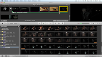
Uploading footage and beginning to link videos with the music and adding transitions. Learning the basic tools needed to create a professional music video.

Removing and cutting useless
footage and creating a storyline accor
ding to our storyboards. Following our storyboards very closely so it gives us a professional structure. Here i am adding a dissolve transition to the music video, throughout i also learnt
how to edit lighting and change it to black and white to follow the conventions and imagery we wish to create.
On location when filming, playing with natural lighting creating chiaroscuro effects to meet the conventions of our music video/artist.


Friday, 6 April 2012

Possible Locations


Media A2
View more presentations from EugeneBongo
We decided not to use the graveyard location as it was too hard to get bright lighting and our actor wasn't visible on camera, also the quality of the shot wasn't very good either.
We decided to use the alleys and the outdoor locations as we thought they linked very well with the song and had natural lighting (lamposts) so the quality of the shot was of a good standard


Story Boards

To create our music video we need to have a basic structure of how we what our music video to go. here we have comprised some basic scene sketches on how we would like our video to go. the camera angles and shots have also been included so that our camera focus is not random or messed with.


Photoshoot

To find our correct model to be The weeknd for our music video, we undertook a photoshoot with a friend of our's who we thought looked the part. The photos are to be used for the digi pack we are creating and will be edited. The Weeknd doesn't usually show himself on his Mix tape covers, he usually has a girl of some sort, but we decided to be different and go against his usual connotations and include the artist this time along with a girl just to add our own twist to it.

Wednesday, 4 April 2012

The Artist : The Weeknd


THE WEEKND : So Far

Abel Tesfaye also know by his performer name, 'The weeknd' is of Ethiopian descent born on February 16th 1990 making him 22 years of age. The singer, song writer and producer currently resides in Ontario, Canada and was noticed and signed to the well known Canadian rapper Aubery 'Drake' Graham's 'OVO XO' record label. Since then he has been remarked as 'The songbird of his generation', as well as 'The best musical talent since Michael Jackson', by big music publications such as MTV, XXL, Rolling Stones, The Source, BET and many many more.

The Weeknd Started a trend in releasing Three 9 song free Mix tape's entitled 'House Of Balloons', 'Thursday' and 'Echoes Of Silence', which is his most Recent Project. He did this under a unknown alias not showing himself untill the release of his second Mixtape. Once he started of with 'The House Of Balloons' Mixtape as a free download on his website the-weeknd.com The rise in wanting to know who it was behind this great music grew more and more and within months the second Mix tape to the 3 part trilogy was released, this time people being more aware of what was to come and what talent was there to be on show, the second mix tape was downloaded so much that the weeknd's site crashed and had to be rebooted. His Latest project and Mix tape called 'Echoes Of Silence' was more of a tribute to his Idol Michael Jackson with a 'Dirty Diana' Cover tribute towards him. All of these Mix Tapes can be found and downloaded on his website for no fee what so ever and in my eyes is a very clever idea as a promotional tool to raise awareness to the music industry of who you are.


The weeknd for all of his songs released has purposefully not created music video's as he would like to remain mysterious and thought about towards his fans. However, he does have one video to the song called 'The kowing', off of his first mixtape 'The House Of Balloons', in which it's more of a clever slideshow of images and dreams put together to create a un-surreal world and vision http://www.youtube.com/watch?v=vPp5Ty9EE6k

The Weeknd within his music is very emotionally tied, talking about taboo subject's such as Alcohol, Drugs and very commonly women. his lyrics are very deep and dark making his listener zone out to what is known as 'High Music' here is some lyrics from his song entitled 'XO The Host' from his 'Echoes Of Silence' Mix Tape. http://www.killerhiphop.com/the-weeknd-xo-the-host-lyrics/

I as a listener and fan of his music find it rather entertaining and inciteful as he sings and describes a dark world he lives in that many of us can only wonder about. his music being very viral has had a dramatic affect on his status as a musician raising awareness of him self to many big musicians and important people in the music industry.