To complete the evaluation of our created media texts we used Web 2.0. we used a mix up of Social networking websites such as Youtube, Facebook & Twitter. These social networking websites were used to share our texts and receive Constructive criticism from people who view our video. We used the website Blogger to show evidence of our work and progress. This was a self created blog with our own input's of what we thought and found out. This was so that we could shows our progress as we designed or processed different media texts.
Thursday, 26 April 2012
Evaluation Q4 :How did you use media technologies in the construction and research, planning and evaluation stages?
To complete the evaluation of our created media texts we used Web 2.0. we used a mix up of Social networking websites such as Youtube, Facebook & Twitter. These social networking websites were used to share our texts and receive Constructive criticism from people who view our video. We used the website Blogger to show evidence of our work and progress. This was a self created blog with our own input's of what we thought and found out. This was so that we could shows our progress as we designed or processed different media texts.
Evalution Q3 :What have you learned from your audience feedback?
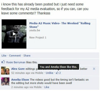
Once the video was posted it wasn't to long before the first comment of criticism came in. 'Editing is good but more shots would have been better' from this me and my group can tell that our skills in how we post produced this text was of good quality but people wanted to see more in terms of scenes. this is something we can take in to account when creating another video in the near future.
Evaluation Q2 :How effective is the combination of your main product and ancillary products?
We also took in to consideration the Weeknds Image. He often looks really rough and represent the hardcore drug and alcohol abuse look. To Recreate or adapt this look in to our own work we had to style or model Roger Dos Santos, in to wearing a Vintage sleeved denim jacket with Black, acid washed jeans along with black high top supra's to complete the look. This look is the most common Weeknd look as he refers to this look as his 'getting high' look. This was key when editing The photos for the artwork for the album cover, allowing us to make the photos look more vintage and rough as to the a pose natural every day photo. this also creates and gives a enigmatic feature to artwork of the Digipak as that is what our artist is all about being.
When Creating the Promotional poster for the Digipak, to give the stern image of it's professionalism we included and used David Burtons uses and Gratifications theory, inviting and appealing to our teenage demographic we included. We included social interaction websites such as Twitter & Facbook. These are the most common forms of social networking visible to our teenage demographic and society today. They also offer and represent web 2.0, along with the smart phone bar code reader. this applies with the recent technology advances in which smart phones are able to scan a code and obtain information on a product or what ever that bar code represent or promotes, straight to their hand held device.
When creating our products and ancillary products we have tried our very best to adapt our artist style and suave in to our products, being very careful in what features we mimic & recreate from scratch. We have made sure that our product reaches and applies to our target audiences needs along with their specifications. The way we have interlinked our products is that to make our products meet each other in terms of relevance and style but we have still managed to keep our products different and not repetitive or exact mirror creations of each other.
Evaluation Q1 : What ways does your music product use, develop or challenge real forms of media products?
A lot of R&B video's sequencing fade and cut in to each other rather strongly telling a very clear structured story. There are a lot of pans with close up shots used. slow motion shots or slow shots often create a dramatic effect on the video, giving the video's meaning a more serious look. These are used to portray and show how the artist is feeling about the topic or brief at hand, often sad or regretful, with the sub genre which sub-verts from the stereotypical inclining the artist to do the opposite within the video deciding to forget his/her troubles by going out and having fun with his/her friendship group.
the narrative structure usually follows the Equilibrium, disruption, Equilibrium either reached, reached but not the same or unresolved. This is common with most R&B music videos as they all try to tell a story to their viewers. the artists within the genre are predominantly represented as regretful individuals, who are emotionally unstable in terms of how to deal with their current affairs. The lyrical content involved within the music usually talk and specify feeling for the other or ex-other half.
Mise-En-Scene within these videos often consist and or are build within a domestic environment. if not then a form of transport or out door sub-vert is used to show the artists thoughts really moving him/her in to another light. photos are used to represent what is and what was within a music video almost acting as a more graphical still watch. bathrooms and clubs are used rather frequently within R&B music Videos as these places tend to be where people go if the're sad or happy within the music world of R&B.
I and my group when creating our own music video, taking in to account all the product and audience research done, we decided to adapt and subvert some of the typical R&B conventions. for example we decided instead of keeping our videos colour, we decided that because we're covering such a dark themed song to make it black and white, bringing malnourishment to the video of it's vibrant colours. we chose to do this as we wanted to be different from the typical always in colour video.
We edited the video's sequencing by making each shot either cut or fade in to each other as most R&B video's do this to keep the storyline and frequency of the video smooth. we decided to include a female and drug within our video as our song choice talks about this within great detail and also follows the Genres forms of conventions.
to create our own music video based upon the genre R&B we also used pans and close up shots to put together our music video. We decided to follow the conventions of the camera angles because we personally thought if we had filmed it any differently i perhaps wouldn't have given the dark, mysterious effect we wanted it to.
When and my group created our digipak, the first thing we noticed was that it folded out in to a long rectangular shape, we also noticed that there were a lot of images consisting of 6 sides, meaning a image on each side. we also noticed instead of having 1 tray like a normal CD. The digipak was a beholder of two trays. a convention that did surprise us as we though there would be some differenece is the digipak uses just like the normal CD covers, the song tittles remaining on the back cover of the panel.
When we created our Digipak me and my group decided to adapt all the conventions of a Digipak with no challenging involved as we felt our target audience would find it awkward enough opening the digipak, so try to not make it any more strange. When I and my group created our Digipak, we decided to keep the layout but add the weeknd, who is the artist we're looking at. we decided to place a picture representing an aspect of his that he sings about or represents him self.
Whilst looking in to magazine adverts with my group, we noticed that what ever medial text is being advertised it takes up two thirds of the page with the Album, Artists Name and the release date all being at the masthead of the advertisement. There is usually a award or prestige that the album has won or been nominated for. We also found the magazines own personal review captioned at the bottom to anchor the whole advertisement together.
When I and my group created our magazine advert for our digipak, we decided to follow all the magazines conventions as we felt comfortable doing so. it also apeald to our target audience as the magazines conventions that we followed was predominantly read by our target audience . We placed the panel in the front so people understood that, that was what was of importance along with the Release date, Artist Name and album title at the top. We also Included our on Caption and included website in to our design by putting the artists Facebook, Twitter and website across the bottom to signify the many different types of media approaches. We also included a 'Smart Phone Scanner'. This is a little code that a smart phone scans and is able to get information about the album straight to their phone.
When creating all of our products we didn't really try to challenge media texts already out there we decided to develop and use different conventions, adding our on twist as this is what we felt more comfortable doing as a group. We figured instead of trying to change our target audiences preferences we should just simply cater to them that way we have hard hitting products that we know our target audience will like.
Media A2 Music Video- The Weeknd "Rolling Stone"
Digipak
This is one of the inside panels. I have chosen to include 3 photo’s as the weeknds Mixtape art work consists of multiple photos on a cover. The lips are their to signify mystery and lust. Also the photo of the chosen model drinking alcohol, portrays one of his many addictions.
This is one of the inside panels. We have purposefully taken a photo of his clothing with no face. This is to show his rough and not caring look. I have edited the photo so it looks vintage and almost lifeless as this is what the weeknds Mixtape cover’s often consist of and look like.
This is another panel. We have purposefully chosen a girl to represent his lust for love and beautiful women, that he sings about within his songs. He generally tends to sing about how he hurts or mixes females with drugs in a absolutely crazy world.
This is another panel within the digipak. I’ve taken a photo of just pills as the weeknds theme of music lyrics consist of drug talk and constantly ‘popping’ or indulging with people who ‘pop pills’, to get their thrill or kick out of life.
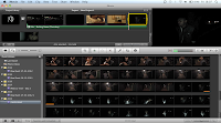
Editing (During)
Friday, 6 April 2012
Possible Locations
Story Boards
Photoshoot
Wednesday, 4 April 2012
The Artist : The Weeknd
Sunday, 4 March 2012
The Weeknd - The Knowing (Official Video)
This is the first video that the Weeknd has constructed for one of his newest songs. Here you can see the artists idiosyncrasy compared to other R&B artists as well as the enigmatic video approach. This is not a conventional music video, its got a mysterious reading to the audience and creates a sense of "being on drugs".
In terms of how it relates to videos today, it still includes a girl and an intimate moment occurring, the rest is trying to portray that he is on drugs hence the "weird" images.The story to the video links with how Haile Selassie was overthrown by his own people during his reign of Ethiopia. It's symbolism for how The Weeknd was betrayed by his girl.
This is just an example of the type of music and representations the Weeknd portrays, we aren't going to be following his footsteps in terms of this video, but we will be using very dark lighting and some unusual images in our own music video to try and meet the conventions of the Weeknds music.
Saturday, 7 January 2012
Analysis Of Music Video - Robin Thicke Love After War
http://www.youtube.com/watch?v=JwFtfnUGJfg&ob=av2e
Robin Thickes' Twitter
http://twitter.com/robinthicke
MISE-EN-SCENE
For the mise-en-scene of this video is rather simple but sophisticated in the way that it is used and laid out for the video. You have beds being used giving of the iconography of peace and love, with usually slumbers or
coupled connotations. Window seals and bathrooms are also used but these are not of modern day quality, these are of 1960’s old manner house quality, giving the video’s look a timeworn age. There are ices of lingerie and beautiful furniture used for example the red double seated. This gives the connotation of trouble as these as these common double seated benches are used mainly in couple’s counselling meetings as waiting chairs.
Only two people are used within this video, those being the music artist, Robin Thicke and the beautiful young lady who is playing his other half,Paula Patton. Bothe are dressed in opposite ends of the table, with Robin Thicke dressed in wonderful, vibrant cotton sweaters, accompanied by a dark blazer, this gives on the connotation of a well presented and high earning man. The iconography for this is that he has the power and is of great importance within this music video. Thickes’ co-star however is portrayed and given connotations of the slutty wife, who is disrespectful and mischievous. She throughout the video is
seen in nothing more that leather body pieces and towels with glasses on. Both stars within the video are wearing glasses, which are usually worn if sunny weather occurs, but within this video there are no outside shots meaning the glasses are being worn as a representation of a secret, as if there both covering something up.
CAMERA
The camera shots used in this video are mainly based and created to show the stars body languages which is different to the usual modern day shots within R&B of Extreme Close Up’s (ECU’s) of the face to show feelings and emotions. Within this video a lot of Medium Long Shot’s, Medium Close Up’s and Close Up’s are used instead of Extreme Close Up’s, breaking the typical R&B structure and mould.
The camera movement within this video is very limited as to the different types of tracking, tilts and pans that are used, in fact there are barley any, although there is a lot of footwork shooting, with the camera being held by someone so the footage is somewhat unsteady, giving you the effect as if you were there. There are also different height levels of shooting, with not just above the waist but also below on the ground also, which I really found interesting and something to perhaps delve in to. R&B structure and mould.
ENCODING/DECODING
I think that the preferred the audience will obtain from this piece of text is that life and relationships are difficult as well as tough to understand and cope with, but even then you should soldier through it and fight for what it is that you want. In terms of gratifications and pleasures offered to the preferred reader I would personally say that this piece of text informs and educates helping those at a standstill in their relationships with their spouses. I also think
this video offers social identification as some of the preferred readers may be able to say once watching this video, “yes I to can relate to what is going on within this video as I deal with the same issues in my everyday life”. I also think it offers Social interaction as the viewers may be able to talk about what is going on within the video and how it affects them in terms of their own Love life.
The groups represented in this are Middle aged white men, of class A1 to b, between their early 30’s to early 40’s. Within this text they’re represented as sophisticated and classy in the way that they dress and approach rough domestic relationships. The second group represented within this piece of text are young women ranging in the early 20’s to middle 30’s. Their class would be that of the B to C section. Within this piece of text they’re represented as hard and a struggle to put up or deal with, representing and backing the dominant ideology, that women within relationships are always the main cause of problems or difficulty’s, That man often having to put up with whatever the female throws upon to him.
EDITING
The pace of the shots are rather different to your typical everyday R&B videos as within this video they are very sluggish and deep, were as in most videos common like this one the shots are all pacey and sharp to change in to the next scene. The transitions used within the video are
mainly fades and cuts, at the begging we do see a zoom out on text written in French with the subtitle written in English underneath. A French male voice over is used to anchor the open sequence down with the video, again representing the common ideology of French language being the ‘Language of Love’.
Thursday, 5 January 2012
Analysis Of Music Video - R Kelly Iginition
http://www.youtube.com/watch?v=y6y_4_b6RS8&ob=av2e
Analysis Of Music Video - Usher Burn
Audience Theories
The first theory i will be talking about is the Blumer
IDENTIFICATION: This is when the target audience can relate to the piece of media because they have either been through the situation or can relate through some similarity.
ENTERTAINMENT: This makes the target audience feel something or react in a certain towards the piece of media.SOCIAL INTERACTION: This gives the target audience the ability to talk to others about the piece of media he consumed.
ESCAPE: This is a piece of media that offers the target audience a reason to relax and forget about the troubles there real life has and almost live the life the character within the piece of media has.
There is also a different approach to Media intake going by the theory of Richard Dyers' Utopian Solution's Theory. This having 3 main reasons for consuming the media. These are called Inadequacy, These are isolation, Confusion and Boredom to these 3 reasons there are answers these answers are Community, Clarity and Excitement. This theory is very simple and easy to understand with the table involved.